WEBINAR TURKEY
Client
Webinar Turkey
Timeline
Oct '22 - Dec '22
Tools
Figma
Adobe Illustrator
My Role
UX/UI Designer
UX Researcher
OVERVIEW
PROJECT BRIEF
- Outdated visual design
- Poor user experience
- Lack of content hierarchy
- Unorganized static content
- Not mobile-friendly
💫 MY ROLE
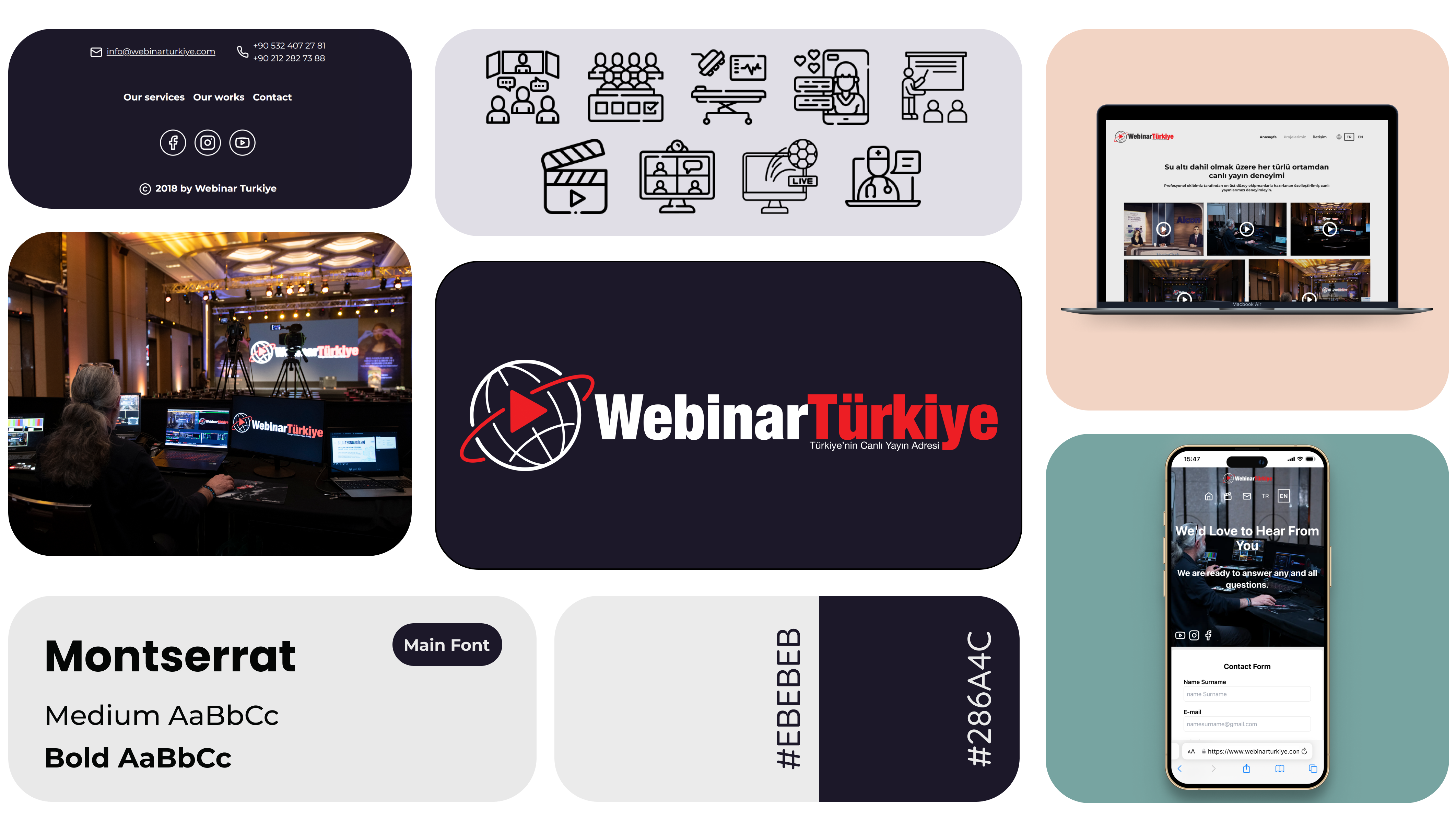
I redesigned the website, resulting in a fresh, modern look that enhanced the user experience and make it easier for potential clients to explore their Webinar projects. To further expand their reach, I also developed an English version of the website for international clients. 🔸 DESIGN ROADMAP 🔸
01
DISCOVERY
Current Website Analysis
Identifying Challenges
Competitive Analysis
02
DEFINE
User Personas
Empathy Map
03
IDEATION
Wireframes & Prototypes
Brainstorming
Information Architecture
04
DESIGN
Visual Design
Color & Typography & Iconography
DISCOVERY
COMPETITIVE ANALYSIS
- The website lacked a visual language and brand identity.
- The overwhelming layout made user navigation difficult.
- The website wasn't optimized for mobile devices, limiting accessibility.
- The users cannot explore the projects because of the unorganized portfolio.
USER RESEARCH
MEET WITH USER
What specific improvements or features would you like to see?
How can we enhance the user experience on the redesigned website?
SOLUTIONS
KEY FEATURES
NEEDS
- More informative pages
- Convincing portfolio
- Being more visually aligned with the brand
- Improve the mobile experience
- Introduce an English version
MOTIVATIONS
- Fostering trust with potential clients
- Creating more opportunities for business growth
- Reaching a global market, attracting an international audience
- Increasing website traffic and user engagement
WIREFRAMES & PROTOTYPING
DESIGN
VISUAL DESIGN

GENERAL OVERVIEW
In this redesign project, I transformed a visually overwhelming website into a user-friendly platform. My objectives were to enhance visibility, simplify navigation, and improve aesthetics while it aligns with brand goals. Also, to make the website more global and accessible, I created an English version.
Future improvements could include conducting user testing, analytics integration and user feedback (especially contact form usage).
HOMEPAGE
I redesigned the homepage to be clear and easy to navigate. Now, it showcases recent projects and services to better understanding, which potentially boost conversion rates and satisfaction.
PROJECT PAGE
In “What we did” page, I resolved the issues by improving project hierarchy and requiring user-initiated video playback. This improves the content organization and promotes the projects effectively.
CONTACT PAGE
I added a contact form for direct interaction, intuitive icons for easier navigation, and a map for precise location details, which will result in increased user satisfaction and usability.
REFERENCES
The crowded references page is now user-friendly, integrated directly into the homepage for easy viewing of listed businesses. Previously, the text-based references were hard to read. Now, with visible logos, users can easily identify and understand listed businesses, which will contribute to the company’s online credibility and brand perception.
🡮 Don't forget the visit the website 🡯
MY OTHER CASE STUDIES
#APPDESIGN
WORDIEST APP
Designed a personalized vocabulary building app for a lasting word retention and context-rich learning experience.